Shopifyで、画像バナーをデスクトップでは非表示にする方法を解説します。今回使用するテーマはDAWNです。
まずは「セクション」フォルダ内のimage-banner.liquidファイルを選択し、schemaに下記を追記します。
{
"type": "checkbox",
"id": "hide_desktop",
"default": false,
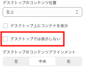
"label": "デスクトップでは表示しない"
},これで管理画面に表示・非表示を選択するチェックボックスができました。
次に、チェックが入っているときだけクラスを付与するコードを記述します。
変更前:
<div
  id="Banner-{{ section.id }}"
  class="banner banner--content-align-{{ section.settings.desktop_content_alignment }} banner--content-align-mobile-{{ section.settings.mobile_content_alignment }} banner--{{ section.settings.image_height }}{% if section.settings.stack_images_on_mobile and section.settings.image != blank and section.settings.image_2 != blank %} banner--stacked{% endif %}{% if section.settings.image_height == 'adapt' and section.settings.image != blank %} banner--adapt{% endif %}{% if section.settings.show_text_below %} banner--mobile-bottom{%- endif -%}{% if section.settings.show_text_box == false %} banner--desktop-transparent{% endif %}{% if settings.animations_reveal_on_scroll %} scroll-trigger animate--fade-in{% endif %}"
>
classに以下のコードを追記します。
{%- if section.settings.hide_desktop != blank -%}hide-desktop{% endif %} 変更後はこのようになります。
<div
  id="Banner-{{ section.id }}"
  class="{%- if section.settings.hide_desktop != blank -%}hide-desktop{% endif %} banner banner--content-align-{{ section.settings.desktop_content_alignment }} banner--content-align-mobile-{{ section.settings.mobile_content_alignment }} banner--{{ section.settings.image_height }}{% if section.settings.stack_images_on_mobile and section.settings.image != blank and section.settings.image_2 != blank %} banner--stacked{% endif %}{% if section.settings.image_height == 'adapt' and section.settings.image != blank %} banner--adapt{% endif %}{% if section.settings.show_text_below %} banner--mobile-bottom{%- endif -%}{% if section.settings.show_text_box == false %} banner--desktop-transparent{% endif %}{% if settings.animations_reveal_on_scroll %} scroll-trigger animate--fade-in{% endif %}"
>
最後に、デスクトップでは非表示になるようにCSSを記述します。
{%- style -%}
  #Banner-{{ section.id }}::after {
    opacity: {{ section.settings.image_overlay_opacity | divided_by: 100.0 }};
  }

  {% comment %} 以下を追記 {% endcomment %}
  @media screen and (min-width: 1200px){
    .hide-desktop{
      display: none;
    }
}
min-widthの値は自由に設定してください。
コードの書き方を少し変えれば、スマホのみ非表示にすることもできます。